Thursday, November 18, 2010

A Pillow's Worth a Thousand Words

So yes, it has been two entire MONTHS since my last post, and rather than bore you with excuses, I thought I'd let this pillow do the talking for me. Buy it here.

Now back to work!

Saturday, September 11, 2010

Fantasy Dining


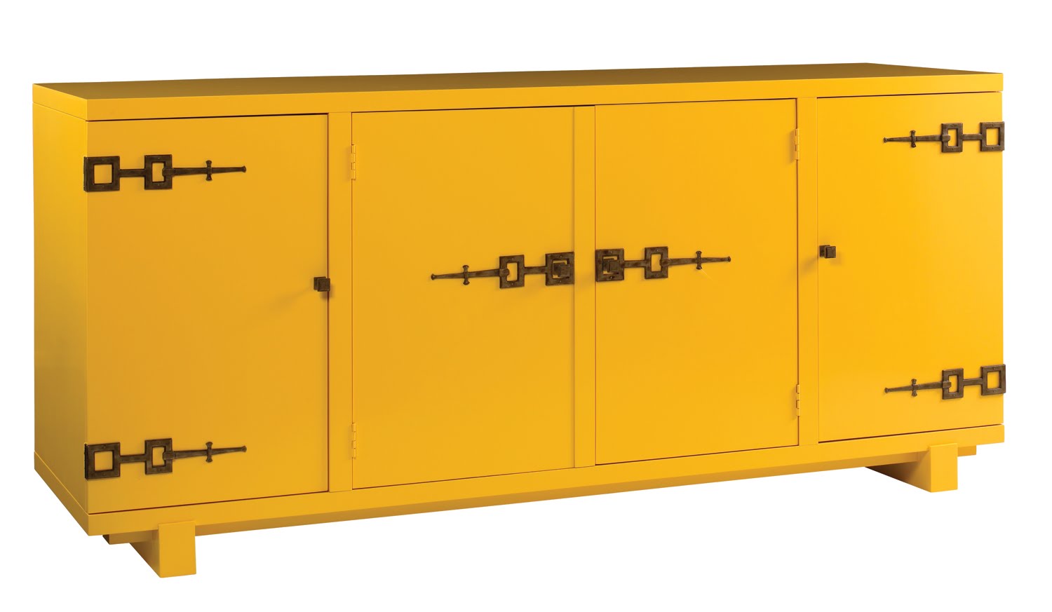
Iconic sideboard from Oscar de la Renta's collection for Century


It doesn't quite have the ring of "Fantasy Island," but assembling a dreamy fictional dining room was at least as fun as being greeted with, "De plane, de plane!" (Am I aging myself here?)

But I digress.

Seattle Homes & Lifestyles magazine graciously invited me to offer my take on "traditional," which as those of you who follow the blog know, it's basically not so much, though I do occasionally have thoughts of covering an entire room in toile...you know, in an ironic way.

I got to create my own client profile, and I'm now wondering what it says about me that I made her a single, childless woman of my own age. My interpretation of traditional was to design a classic dining room with a more contemporary palette and finishes, and upon reflection, it's basically the room I'd create for myself with A) more money and B) no children.

Being broke and with child(ren), and actually no dining room at all, I've opted for a functional but quirky eating nook that serves as our primary "hanging" spot in the house, but more on that in a few months. (We're prepping for a photo shoot of our home in a few weeks, to hit a magazine near you next year! Stay tuned.)

Take a look at the spread from the magazine, and be kind when taking in my rendering.

Here are some of the dreamy items I included:

The Empire Chandelier we all know and love, from the uber-fabulous Marjorie Skouras

To-die-for vintage pink Murano glass lamps from Swank Lighting

My current favorite dining table, the Phillippe by Oly Studios


Also from Oly, one of my favorite chairs of all time...
...tied with this one, a reinterpretation of Frances Elkins' classic design by Hollywood at Home

What you can't see well are the ahhh-mazing Jim Thompson striped silk curtains and Moroccan-influenced cotton sheers, or the just-right-shade-of-turquoise leather seats on the Frances Elkins-esque chairs and the canary yellow Kravet ultrasuede on the Oly chairs. (I know, ultrasuede....?....but a great color and completely cleanable, a must for the dining room.)

And we have previously discussed the fabulousness that is Cassandria Blackmore....she is, of course, a key player in my little fantasy, and this piece was the inspiration for the room's color scheme:


Maybe someday this will be a reality for me, but for now I'll have to live through my fictional client and my little rendering.


Saturday, August 28, 2010

High/Low


For months (years?) I have been drooling over virtually everything made by Hudson Furniture -- you've undoubtedly seen their minimalist ads in Elle Decor, House Beautiful, and more, touting the likes of these:


But what has really had me swooning all this time is the following chandelier, dubbed "The Atlantis":

Certainly it wouldn't work for every aesthetic, but in the right spot, it surely has to be one of the most gorgeous fixtures ever designed.

Being a curious sort, I called Hudson at one point to investigate the likelihood of me ever owning one -- i.e., finding out the price -- and it was something that far exceeded my budget...in the neighborhood of five digits.

I almost fell over a few months ago when delivering a chair to a client's home and I spotted what I thought was this very same fixture hanging in her stairwell. The conversation went something like this:

ME: (Gasp...choke...more gasping) Is that a...Hudson...chandelier? (More gasping.)
CLIENT: Oh, god no... I wish. It's a knock-off that I found online for less than $2K.
ME: (Gasp...gasp...gasp) Must. Find. Out. Who. Makes. This.

Well, I did, and here it is:

A blatant rip-off? Yes, but also a life raft for those of us for whom five-digit lighting fixtures are, shall we say, aspirational.

This one retails with us for $1,950. I am dying for someone to order one or select it for a project so I can ogle it again in person. Who's game?

Friday, August 27, 2010

Jumping the Shark


Subway posters, now produced en masse by Restoration Hardware

Originally coined to mark the beginning of a television show's demise, "jump the shark" has become one of my favorite ways to describe the "over-ness" of something, be it a fashion look, a celebrity, or especially an element of home decor.

The phrase was created by a pair of clever fellows who noted that the moment when the TV series "Happy Days" began its decline coincided with the episode in which the Fonz attempted to jump a shark on his motorcyle... though the series continued for another seven (!) years after this incident, it was never quite the same.

I've been feeling lately that a lot of my once-favorite decor elements have jumped the shark...for me, once you start seeing the special things you love mass-produced by the likes of Pottery Barn, Restoration Hardware, etc., it's time to do one of two things: Store them away until people begin to forget they exist, or proudly accept that you still love something that has become part of the masses.

It also begs the question: where is the line between trend and classic, eloquently addressed HERE? When does something go from an "of the moment" decorating motif to a timeless element to be used again and again? It's a tough question...but is it even worth answering? Should we always follow our "decorating heart" and use what we love, despite where and how often we're seeing it elsewhere?

Have these iconic items jumped the shark? What do you think? Trend or classic?

Canopy chair from Restoration Hardware, re-introduced to most of us years ago by Kelly Wearstler in her projects for Bergdorf's, the various Viceroys, and more.

The ubiquitous "Keep Calm & Carry On" print, now seen on everything from tea towels to rugs to posters of all sizes sold by Amazon.com!

Moroccan Beni Ourain rugs, here used by Jonathan Adler at the Parker Palm Springs.

Cameroon headdress, most recently seen (by me, at least) on the wall of the divine Diane von Furstenberg's home (or one of them!)...pretty much all I need to see to feel okay with continuing to use them.

The Greek Key motif, revived in a big way as part of the resurgence of the Hollywood Regency design style.

Moroccan poufs

Let me go on the record as stating that I own (and continue to love) more than a few of the items listed above, and have a home filled with Chiang Mai and La Fiorentina, which perhaps gives some indication of my own philosophy on the issue of use/not use... but what do you think?

Tuesday, August 24, 2010

If Wishes Were Horses...


...I'd have a whole stable of daily blog posts for you to read. (Too far of a metaphor stretch?)

If it counts for anything, I think about blogging a lot. Seriously, how do people do it? Between keeping my two kids alive, manning a shop, overseeing design projects, managing e-mails and phone calls, nodding to my husband in passing, keeping our Jack Russell Terrier from killing any more of our neighbors' chickens, survival amounts of laundry/cooking/cleaning, I can't seem to muster the energy to crank out interesting blog/Twitter/Facebook/(insert social media of choice here) updates.

Am I alone here? You moms out there: How do you keep it together? Seriously. I want to know. Please, someone tell me it's not just me.

I have a crazy amount of gorgeous images, fantastic project updates, amazing new products and designer crushes to share with you, but I am just too tired to transfer them from my head to the digital world. But on the plus side, I'll finally have a clean towel for tomorrow's shower.

Friday, June 25, 2010

Domestic Bliss

Green Velvet, Julie Blackmon

Blogging is a lot like exercising -- the less often you do it, the harder it is to get back into the swing of things.

Fortunately, today I stumbled across something that excited me enough to lace up my running shoes and head out for a blog... that something is photographer Julie Blackmon.

Thanks to the weird, circuitous world of the Internet, I discovered Julie's work via One Kings Lane's recent sale of photo editions from Hamburg Kennedy Photographs; I quickly developed a fixation on Massimo Vitali's diptychs and triptychs, which sent me in search of HK Photograph's site. They represent some amazing photographers, and as much as I go weak in the knees for paintings, there's something about a great photograph that always stops me dead in my tracks.

Enter Julie Blackmon.

Her work combines everything I love about, well, everything: Color, humor, interiors, and family.

And now, thanks to Julie, in addition to seriously coveting her photograph entitled "Green Velvet," I feel compelled to go recover something in...green velvet.

Which is your favorite?

Tippee Cup

Family Portrait

Crystal Ball

Boar Head

Babysitter

Friday, June 4, 2010

Holy Oly!

In addition to the amazing food and diverse culture, I've found yet another reason to live in the Bay Area: proximity to Oly's annual sample sale!

A California client of mine was able to attend, and scored five pieces for the retail price of one of the pieces alone, so let's all plan a field trip for the next one, shall we?

Her treasures included the gorgeous Dominique cabinet shown here, planned for her daughter's room:


Can't you just see the interior painted a lovely pale blue or, for the more adventurous, a kelly green lacquer?

My client purchased one in the silver wood finish, shown here:

Sadly, when she returned home, she realized the piece was too large for the room, so she'd love to see it find a good home. The normal retail price on this piece is $6, 250, but for you, only $2,500! Too good to be true.

If you're intrigued, drop me a note and we'll strategize.

Happy weekend!
Blog Widget by LinkWithin