Thursday, July 30, 2009

No Doubt About It...

I love color, and so does playwright/Renaissance man John Patrick Shanley, author/director of hits like Doubt and Moonstruck, whose adventurous home was recently featured in the New York Times Style section. For my money, nothing has the power to so simply lift your mood, communicate your style, or change a space like color.

I don't think of Seattle as a community that especially embraces bold color, but I'm trying to do my part to change that....at least, in my home and shop. Baby steps, Seattle.

Here are some of my favorite shots of Shanley's home:


Stop by here to learn more about this interesting fellow and see additional interior shots.

As if I didn't like him already after seeing inside his apartment, this quote from the article cinched the deal:

"One object that isn’t on view is his Oscar for the movie Moonstruck. 'I wouldn’t want to have it out,' he said. 'It’s not good for me, when I’m trying to write, to see an Oscar, and for the kids it’s not good at all. You never want them to feel like, "I can’t beat my Dad." They should be able to feel that they can bury you at any time.'

Well said.

Wednesday, July 22, 2009

B & F = BFF


In the spirit of the times, even our "to the trade" friends are getting in on the sale action, and one of our favorite lines, Brunschwig & Fils, is discounting all in-stock fabrics, wallpaper, lamps, tables, and mirrors by 15%. (Though I love them, saying their name aloud makes me feel like one of those people who says "Me-hee-co" when referencing our friends south of the border. Just so you know.)

While you may know Brunschwig & Fils primarily for their staple of design magazines and blogs over the last few years, "Dzhambul"...


...they have a wide array of other lovely fabric offerings. Below are samples from their spring 2009 collection:


Additionally, they offer a great selection of wallcoverings that run the gamut from traditional to transitional to contemporary, and some that could be any of those, depending on the space and design concept. For instance, I can see this pattern being all things to all people... throw in some white lacquer and pink accents for us Hollywood gals, pair it with some walnut, black and gold for the traditional folks, and a little bit of what falls in between for those who don't take sides.


Cruise around their site, and drop us a line if you'd like us to check pricing and stock on anything that catches your fancy.

It begs the question, is "sale" the new normal? Deep thoughts.

(All images courtesy of--i.e, pilfered from--Brunschwig & Fils Web site)

Saturday, July 18, 2009

WHAT? (or, Why I must go to L.A. July 24)

Exterior, Woodson & Rummerfield's L.A. shop

A friend and customer just forwarded me the following e-mail, bearing a headline that has become the mantra of so many retailers lately (ourselves included):

"It Is Time to Rediscover the Elegance of Basics"

And here's the text that follows, which has got me all in a tizzy:

"Dear valued W&R Patrons,

At the end of July, Woodson & Rummerfield’s showroom will be moving from La Cienega Blvd to ONLINE. http://www.wandrhome.com/

There will be new and interesting home good products online that will have you absolutely pining. This means our online retail site and design offices are continuing onward, full force with many exciting projects in the works!

So, pop by and bid the La Cienega shop farewell on Friday July 24th ~ there will be deep discounts on one of a kind items up to 75% off through out the rest of the month. 724 N. La Cienega Blvd, LA 90069, 310-659-3010."


Interior, W&R showroom

Those of you who know me or follow our blog know how much I love Woodson & Rummerfield, and one of the to-do's topping my list for the last few years has been a visit to their charming shop. Looks like I had better start making my travel plans...who's with me?

In the meantime, I have penned a letter of my own:

"Dear Economy,

You suck.

Sincerely,
Me."

Thursday, July 16, 2009

A Beautiful Day in the Neighborhood

The much-anticipated (she says sarcastically) second installment of my Georgetown Garden Tour series, today's topic is the neighborhood itself -- the images that make Georgetown what it is for me.

Perhaps Georgetown's most fabled building, especially as of late, is The Corson Building. Like almost everyone I talk to about the building, I have, over the years, envisioned myself ensconced here, tending to my Italianate gardens in a caftan and sipping iced tea to the strains of classical music bouncing from the stone walls.

Unfortunately, in reality, I will have to pony up $150 bucks to pass an evening in the garden with tea in hand. I can't decide if it's my schedule or my budget that has prevented me from dining at the Corson Building yet, though to their credit, they now offer a number of more budget-friendly dining options for the masses.


Have you been? What did you think?


I love the colors on this old Ford, or "ord," as the case may be.

My nomination for best mailbox in Georgetown, to be found on the front of the lovely Georgetown Ballroom.

Old metal work separating what is begging to be an outdoor courtyard.

Georgetown's answer to public art.

My favorite local watering hole, which is incidentally the oldest bar in Seattle.

Do I love it so much because of the wallpaper? Probably. But the burgers and tater tots are a close second.

Great storefront for Georgetown Records, a spot I am way too unhip to frequent. But I like that its here nonetheless.

Fruit Cocktail, a charming spot to discover fun, affordable estate treasures. They also combine two of my favorite elements, striped awnings and turquoise. What's not to love?

Another striped awning, this one on the charming Carlton Grocery.
Georgetown, home of toile wallpaper in bars, abandoned "ords," striped awnings aplenty. We love you.

Tuesday, July 14, 2009

Our Friends and Neighbors


Last Sunday marked the annual garden tour in our neighborhood ("our" meaning our home AND our store), which is always a great day for a host of reasons.

Firstly, we have opened our garden as part of the tour for the last four or five years, and we love seeing so many familiar faces returning every year. Gardeners are an interesting sort -- almost all of them are really, really nice, the kind of people you'd want to invite into your yard anyway, so it works out well.

Secondly, it's always a great day to get out and about in the neighborhood, catch up with neighbors and join in the festivities that invariably develop on such occasions. This year was no exception on either front: a great turnout of visitors to our garden, and a wonderful afternoon spent exploring the neighborhood.

I took a lot of photos, so both for the benefit of everyone reading (and to give myself more fodder for blogging!), I thought I would parse them out by topic.

Today's subject? The yard of our friend and neighbor (and Georgetown Garden Tour founder) Jon Dove, whom we at our house have unofficially dubbed "The Mayor of Georgetown."

Jon's house and life are truly straight out of a book; in fact, I've asked him if I can snap some shots of his interiors for sharing with the world, as they are completely divine. Our styles are so different, but his home incites envy in me upon every visit (a fact I know Jon loves, don't you, Jon!).

Jon was actually born in Georgetown and grew up in a charming home on the other side of the neighborhood. As a kid, he would fantasize about owning the house that has now been his for more than 15 years, which he purchased for something crazy like $35,000. (Don't even get me started on how low his mortgage payments are!)

Like me, Jon simply cannot resist a beautiful find, and he has amassed an entire basement full of things like antique toile curtains, metal lanterns, old garden furniture, and so on and so forth. This spring Jon began transforming his detached garage, previously used for storage, into what he calls a garden room, which is now filled with many of his basement treasures. I saw the finished product for the first time on Sunday, and I was completely wowed by its charm and beauty.

Take a look:


The view toward the back of the main house from the covered patio adjacent to the enclosed garden room.


How gorgeous is this vintage lantern, which he found at a salvage store for less than $100? Could you die?


A vignette from the enclosure, featuring the antique toile curtains someone gave Jon more than 20 years ago, when he was 20. Can you imagine being interested in toile curtains as a 20-year-old? Mine would have just gotten doused with beer or peed on by a cat.


I'll bet $100 Jon sits here on a regular basis and writes thank-you notes.


A giant cabinet housing Jon's handmade minature houses and buildings. Seriously.

And as if all that weren't charming enough, his garden is spectacular and actually received one of the area's most prestigious gardening awards a number of years ago, Pacific Northwest's top garden designation.

See for yourself:


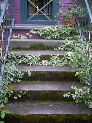
A beautiful moss-covered fountain gently bubbling outside his front window.


His front door. Love it!


A few groupings on his front landing. That plate could go missing someday soon. I'm just speculating here.


I had to share a close-up so you can read the small print. I can relate!


On top of all this, Jon is a wonderful guy who does so much for his friends and his community. Darn him for making the rest of look so bad.

Stay tuned for photos showing the *inside* of Jon's home coming soon. Not to be missed!

Tuesday, July 7, 2009

YES!
Thanks to Style Court for helping us discover this sign that could have sprung from our own minds....except for number 5. (Apologies to you jewelry lovers.)

Monday, July 6, 2009

Spanning the Globe

...or, at least, the greater Seattle area. Yes, we now have a SECOND location (sort of). Does that make us sound full-fledged or what?

We are beyond excited to have a selection of our vintage merchandise represented by the fabulous Pacific Galleries here in Seattle. Long one of our own must-shop stops, it was a natural fit for extending our reach and promoting our vintage selection and design services.

Not being the crafty sort, I was a bit nervous about how my concept would come together, considering the execution consisted of me, a staple gun, rolls of grosgrain ribbon and bolts of fabric from Ikea.... I felt like a "Top Design" contestant. Needless to say, the final product is full of color and a bit on the bold side. Shocked, aren't you? Take a look and see what you think.

I used black and white ribbon to simulate panels, and adorned them with great faceted chrome upholstery tacks from Home Depot.... The graphic fabric covering the back wall is from Ikea! Have you shopped their by-the-yard fabric selection? Some of their patterns are really wonderful for light-duty applications like pillows, window treatments, or something more bizarre like covering entire walls.

But back to our Pacific Galleries booth. A parting shot:


For all you Seattle-ites, much better than photos is a face-to-face viewing. Maybe we'll see you there!

Blog Widget by LinkWithin