Monday, March 30, 2009

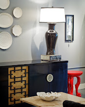
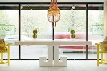
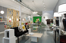
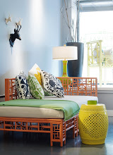
What's Good for Jonathan Adler...

...should be good for you, too, right?

Get your own interpretation HERE.

Image from the Adler-designed Parker Palm Springs hotel. Sigh.

Sunday, March 29, 2009

Pottery Barn Kids - Friend or Foe?

Rugby stripe window coverings from...gasp...Pottery Barn Kids!


So, of course we don't sell things from Pottery Barn here at the shop, but when working on budget-driven design projects, I have been known to specify a number of their products. Many of their items have great bang for the buck and are made well enough to justify shopping with the retail behemoth.

Seeing as I get a "new" Pottery Barn catalog, oh, every third day, I do often take a few moments to flip through and see if anything new jumps out at me. Today the culprint was a Pottery Barn offshoot, Pottery Barn Kids.

While I do have two kids of my own, I usually read the PB Kids catalog with non-kid interiors in mind, as so many of they items are non-kid specific and are often a bit more affordable than comparable items from their "adult" line.

Today's flip-through generated some good finds I couldn't resist sharing, but my main inspiration for devoting a blog post to, in essence, a competitor, was a find I felt so egregious that I couldn't help myself.

But first - the good:


Wicker animal baskets. Need I say more? LOVE them.

This GIGANTIC mobile (they call it a "chandelier") is made up of white paper butterflies suspended from invisible fishing line. I actually have this in my 8-month-old's room over her crib, and it gets more comments than almost anything else in my house.


Tres chic diaper bag. Kate Spade would be proud...or litigious. Not sure which.


See above.

This brings us to the BAD. I'm ranking these from least offensive to most, so stick with me.


Sailboat wall shelf. This isn't so horrible on its own, I suppose, but when paired with the wave mural and the "vintage" life preserver (see below), I start feeling seasick.

Aforementioned "vintage" life preserver. Yes, they actually call it vintage. Um, yeah, I don't think so, Pottery Barn, unless by "vintage" you mean "cranked out in China two months ago by an 8-year-old."

Now we come to the real reason for my post: The Westport Beach House. REALLY? Like it's not enough for dolls to have a fancy primary residence? Now dolls have to get away from it all at their second home? Too much stress at the office? If I were them, I'd be more worried about why I didn't have a face than about finding a spot to soak in the fresh coastal air. Haven't these dolls heard about the recession?

Wednesday, March 25, 2009

Rainy Day Woman

I spotted this drop-dead gorgeous, I must-have-it-now pagoda-style umbrella in one of my myriad e-mail newsletters and had to investigate. Turns out it is designed and made by a local company (love that) and can be customized in a variety of fabric colors and handle colors. At this point in my fact-finding mission, I am ready to order a smattering for the store, until I see that they retail for around $100. This gives me pause.

I think I might pay $100 for a spectactular umbrella if I happened to spot it on a day that I'd just landed a big design job, gotten a call from "House Beautiful" wanting to do a spread on my home, or was fresh off a huge argument with my husband (kidding...sort of). But I'm wondering if I'm being more conservative (my more elegant-sounding version of "cheap") than most.

Would anyone out there buy one of these in the perfect color combination for $100? Maybe I just need a little convincing to pull the trigger.... Of course, feel free to rain on my parade. (Bah dum bum.)

Sunday, March 22, 2009

Goodson and Yummerfield


Okay, those aren't really their names...but they should be. Los Angeles-based design duo Ron Woodson & Jaime Rummerfield have been style icons of mine for a number of years, but surprisingly they were never embraced by our late love Domino magazine in the manner of Ruthie Sommers, Windsor Smith, and others. Perhaps a correlation to the mag's recent folding? Just a thought.


A vignette at their (rumored to be--haven't yet been) fabulous L.A. showroom

What I like most about Woodson & Rummerfield? They go big. They take risks. But sometimes they don't. Based on the diversity of their portfolio, and their showroom vignettes, they have a definitive style of their own, but they seem to know when to reign it in and allow their clients' styles to dominate. Often times a designer's "signature style" is all you see, and it feels as if perhaps the client was buried under fabric samples somewhere along the way.

Not so with these two, perhaps just one of the reasons they were recently named among Traditional Homes' "Top 20" young designers to watch.... They've been our list for years! Just look at them, for crying out loud:


Here are some shots of less "Woodson & Rummerfield"-style interiors, no less lovely:


Did I mention that we also sell their wonderful book, High Style? Read more about it HERE.

And speaking of Traditional Home (a few paragraphs back--trust me), I would like to now go on record as saying that it is sort of filling my Domino void...when I throw in House Beautiful and a dose of Elle Decor, I'm kind of good.

As part of our ongoing in-store design center creation, I have been going through all my back issues of Domino (yes, I have each and every one of them ever printed), and I have slowly realized how much better it used to be. I feel like I'm betraying an old friend, putting that thought in print, but every other page in each of my old issues is dog-eared for an amazing find or a truly ingenious idea....the last few issues, not so much. In fact, I haven't heard too many other people say it, but the last issue? Something of a snoozefest.

In a way I was glad it didn't bowl me over, as my boredom did help to dull the pain of knowing it was the last new issue I'd ever hold, but I was inevitably more sorry to turn the last page with a feeling of disappointment rather than loss.

Lots of heavy talk for a magazine. But still. I know you understand.

Monday, March 16, 2009

Drum Roll, Please


After close to a year of planning, designing, editing, photographing, crying (did we say that last one out loud?), and more editing (and more crying for good measure), the day has finally arrived: Our Web site has launched! (Insert applause here.)

Though it is far from inclusive (we'll get there!), we are so excited with the final product and hope you will be as well.

Check it out and let us know what you think. And please be honest...we can take it. (We think.)

Happy shopping!

More to Love

Some great new items we simply had to share...

Yes, we know it's a bit ubiquitous, Schumacher's "Chiang Mai Dragon" fabric, but we can't stop loving it. Sort of like Oprah's book club selections; everyone's reading them, but they're usually really good.

Also somewhat ubiquitous but still completely fabulous is our beloved Jonathan Adler. We sell a number of Monsieur Adler's products (and can order any of them for you...just ask), and we've long had our eye on his Chippendale dining chairs. Available in assorted colors, we chose lime green, and decided to pep it up a bit by putting some leftover fabric to use.

Maybe it's just us, but looking at this chair increases our heart rate a few points.

Another favorite new arrival: this vintage dining table and Thonet-style chairs.

We found them in pretty sad shape, with serious discoloration and--ugh--orange-brown vinyl seats...

...and decided to work a little magic :

The table has two removable leaves, great for many of our city-sized homes.


We chose a wonderful commercial-grade white vinyl croc print for the seats....simply wipe that food or red wine right off! If only I could do the same for my clothes, but that's another blog post entirely.

Also loving this vintage Cinnabar lamp with new custom white-linen pagoda shade:

Lastly, how could we say no to this?

Sunday, March 15, 2009

Happy Birthday to Us


Yesterday we realized the date (I know, I know... does that tell you anything about my life, that I more often than not have no idea what day it is--bill collectors LOVE me) and, as a result, realized that our humble shop opened ONE YEAR AGO TODAY. Wow.

Some days it seems like just yesterday that we were scrambling to finish painting our walls the perfect shade of grey (Benjamin Moore "Pewter," FYI), staying up all night to arrange merchandise on the store floor, and maxing out our credit cards--oh, wait, we're still doing that. Other days it feels more like 20 years ago. Fellow business owners (and/or parents) can probably relate to this phenomenon.

The idea for the store was inspired by a handful of things:

1. A true love of design, color, and beautiful objects
2. A desire to try our hand at self-employment
3. A love of our community (I live in Georgetown, too) and a profound admiration for my neighbor next door, Kirk Albert of Great Stuff.

Over the last year, I have learned so much about so many things--business ownership, hard work, economic downturns, the importance of supportive family and friends, and how to focus on what really matters. I often reflect on the irony of my timing, but honestly, I'm a big believer that it's never the perfect time for anything; there are always reasons to wait for things--kids, vacations, a big move, marriage--and sometimes you've just got to follow your heart and dive in.

Things have gone remarkably well for us in so many ways, and for that we are so grateful. I never would have imagined in our first year we would be featured in Domino, Elle Decor, and Architectural Digest (the Italian version, but still...). Honestly, if it all went away today, I'd be happy with that alone.

But it has been even better than that: I have had the distinct and wonderful pleasure of getting to know and work with so many lovely people over the last year. I've been welcomed into beautiful homes and families to help them perfect their interiors, spent the day shopping with Domino editor (and Nina Campbell offspring) Rita Konig, have been photographed for two local magazines, and have had the unique joy of telling myself when and where to report for work.

Thank you. Thank you for reading. Thank you for shopping. Thank you for telling your friend about our store. Thank you for coming by to say hello, even when you can't didn't or couldn't buy anything. Thank you for telling us how much you like our shop. Thank you for telling us when we could be doing certain things better.

The recession? Yes, it has been a bit of a drag (she says with much understatement). But we are hopeful for the future, whatever it may hold. We so hope it bears great things for us all.

Happy birthday to us.... (Giant exhale.) We just made a wish.

Saturday, March 14, 2009

Surfing the Web


Through this crazy thing called the Internet, we stumbled across a few lovely mentions of our shop--mainly, our shop's new Web site, but more about that later--and we wanted to share them with you.

The first is by a designer and blogger in...India! What a world, in which someone across the globe finds our shop. If only I could visit India so easily (and inexpensively).

The second is much closer to home, a great graphic design firm here in Seattle called Suite 7 Creative. Check out their very nice post AND their equally great Etsy offerings!

Here are a handful of other blogs we were thrilled to discover thanks to their thoughtful inclusion of our shop:


Thanks for the great mentions, ladies. We are happy to return the favor.

Now, back to Web surfing.

Wednesday, March 11, 2009

Four Rules

Back to blog "borrowing".... spotted this on the wonderful swissmiss and thought it so appropriate, not just for now, but for always.

Monday, March 9, 2009

The Key to Our Heart


As anyone who follows us to any degree knows, we have a little thing for greek keys. I know, I know--it's probably considered "over" by lots of bloggers, trend forecasters, and the like, but really, with its origins dating back to ancient Egyptian times, hasn't it been OVER for, like, thousands of years?

Here's an interesting mini-history of the greek key design motif (seemingly very simplified, but interesting nonetheless) that I found courtesy of one of my new Twitter friends:

"Despite its name, the Greek key motif, perhaps the most widely used classical decorative pattern in history, is actually not Greek in origin.

Variations of this classical pattern are found on ancient Egyptian tombs as well as in Peruvian woven crafts, Chinese architecture and even Aztec sculptures.

The Greeks, however, made the most creative and unmatched use of the pattern in columns, temples, pottery, etc., and truly earned the naming rights to this classical motif.

It is common knowledge that the Romans copied the Greeks, and by the 18th century, the English, Russians and French were copying the Romans. Now, we ourselves have copied the pattern from the Romans, too!

A detail that always refers to the classical era, the motif that was widely used in Greek architecture and furniture is often used to enhance both Empire and Neoclassical style pieces.

Nowadays the versatile and timeless Greek motif is commonly found in chinaware, chairs, tables and almost any piece of any style imaginable."

And yes, we did say "Twitter." We Twitter. We Tweet. We don't really know what those things mean but we are trying to use them convincingly. (Is it working?)

In all honesty, I have not been an early adapter on the whole Twitter thing. I've been experimenting with it here and there but, what with e-mail, blogging, Facebook, and just good, old-fashioned work, rarely remember to use it. Can anyone out there relate? Is it just me, or is all this technology making it hard to get anything done? Am I sounding ancient yet?

If (god help you) you should desire to follow our intermittent comings and goings and incoherent ramblings via Twitter, check us out here.

(Image from 1st Dibs. For three pages of drooling, explore 1st Dibs' selection of greek key-motif-bearing items. That yellow lacquered credenza is causing me physical pain. Nothing says recession like an $18,000 credenza.)

Tuesday, March 3, 2009

Welcome to the Dollhouse


Normally I aim not to crib too heavily from others' blog posts, but sometimes it's justified. Today, my friends, is one of those days.

Great friend of the store (and recently engaged!) Kelley Moore recently posted about what I believe may be the most fabulous dollhouse of all time. Yes, I did say dollhouse. If you follow our comings and goings with any regularity, you've likely discerned I'm not one for things sweet, so you might expect that this is not your mother's dollhouse. It is, however, your most fabulous gay friend's dollhouse.

I wonder if they are too cool to hang with Polly Pockets.

Sunday, March 1, 2009

Words to Live By


Wanted to share what is a sometimes overlooked but much loved part of my home: a sort-of header on our back gate, embossed by my husband with my favorite quote, one I revisit time and again when things seem discouraging. (I even have a ring with the same quote engraved on its face--guess that makes this something of a personal credo, no?)

Over the years the words have become weathered and rusty, which seems the perfect finish for the verse....underneath all the tarnish there is always hope.

Though we are bomabarded these days with all sorts of negative stories and images, I think most of us have a great deal to be thankful for, and optimistic about. Corny (and partisan) as it may sound, I still get butterflies every time I hear our new president speak. My eyes well up when my baby wraps her tiny arms around my neck and squeezes. I am speechless when I go to work and discover that my husband snuck away while I was sleeping to clean my office before my arrival. All of these things make me hopeful about my own future, and remind me of how much goodness exists around me. Take THAT, nightly news!

As we begin to look toward spring, may we all dwell in the possibility of what may be. (Thank you for enduring my rare outburst of schmaltz!)
Blog Widget by LinkWithin